
The simultaneous launch of AirFit N30i and AirFit P10 masks presented a unique creative and operational challenge: two distinct products, two target audiences, and one constrained budget and timeline.
With over 80 deliverables required across print and digital channels and no budget for a custom photoshoot, I led the development of a unified campaign concept that could efficiently scale while preserving each product’s unique value proposition.
My concept: “Dueling Masks”: a dynamic, comparative visual system that highlighted both the shared innovation and differentiated benefits of each product, enabling clearer decision-making for both clinicians and patients.
>> Scroll to the end to view the full case study.
>> Scroll to the end to view the full case study.
Dueling Masks New Features Video / Art Direction and Wigit Design
Launch Landing Page / Physician and HCP Audience
Printed Flyers / Physician and HCP Audience
Printed Mailer / Physician and HCP Audience
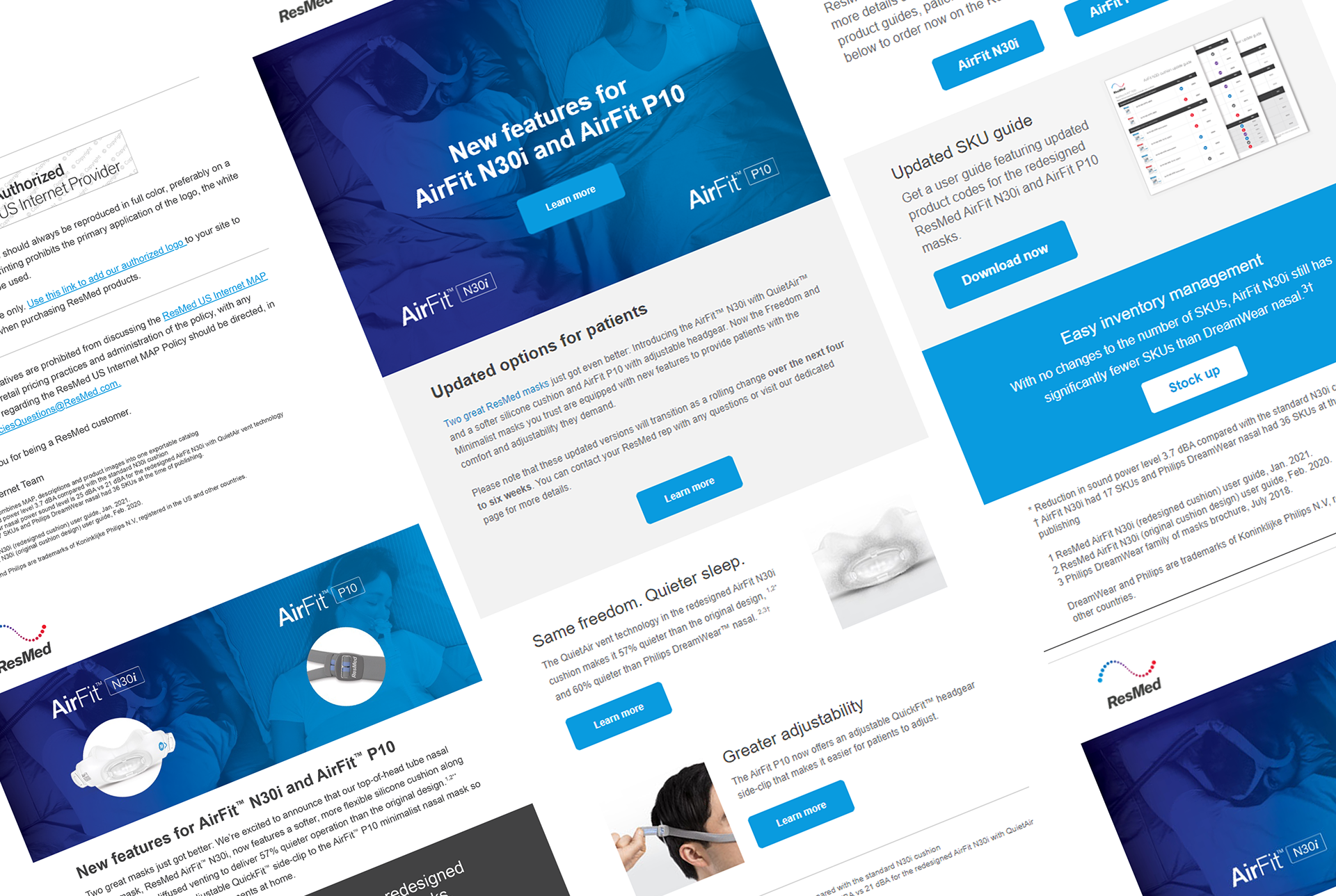
Emails / Physician and HCP Audience
Client: ResMed
Role: Senior graphic designer
Team: copywriter, email marketing analyst, product marketing manager, video production, render artist, web developer, print vendor, seismic lead
Tools: Adobe Photoshop, Adobe XD, Adobe Illustrator, Adobe WorkFront, Adobe Acrobat
Tactics: 80
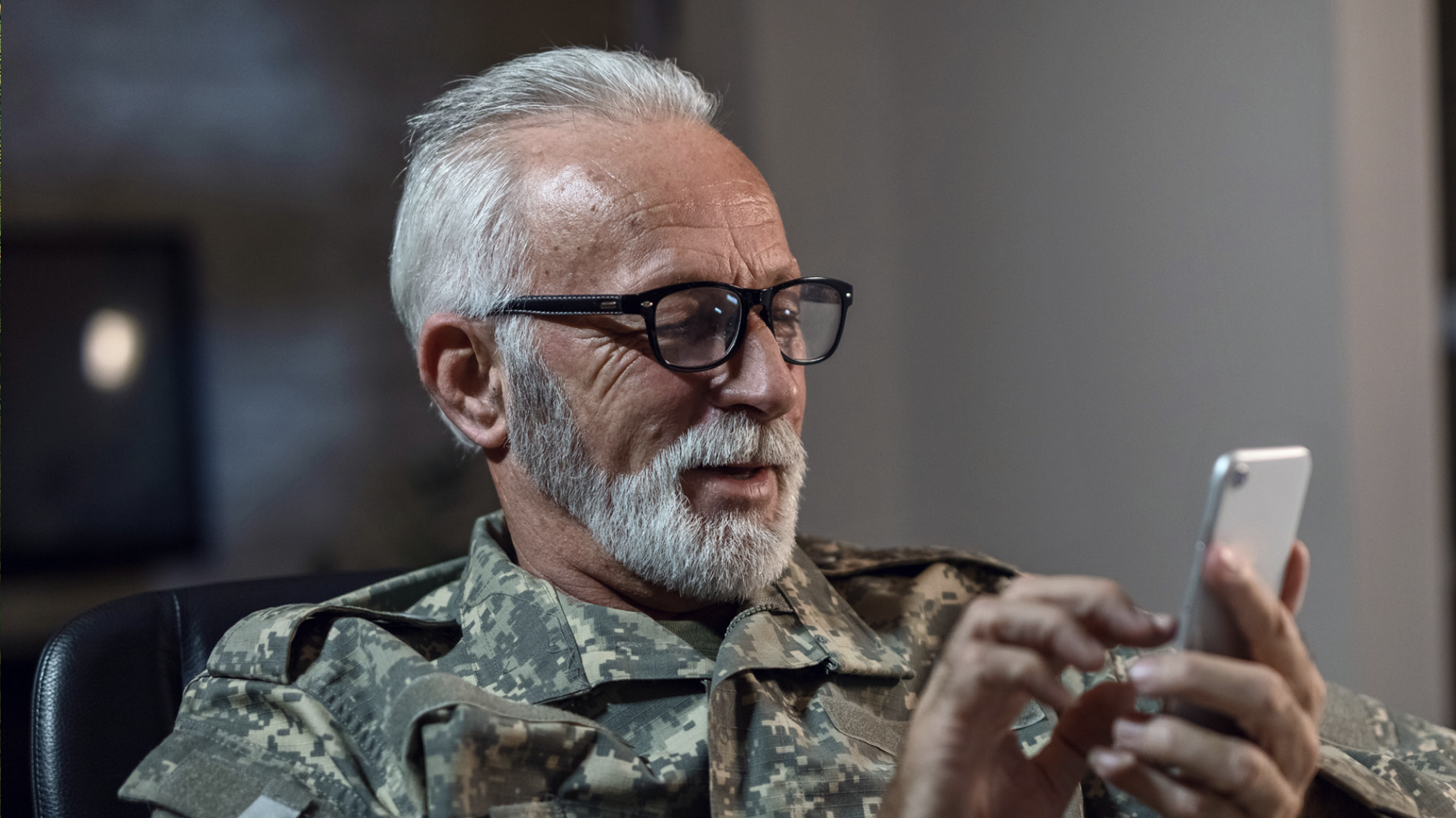
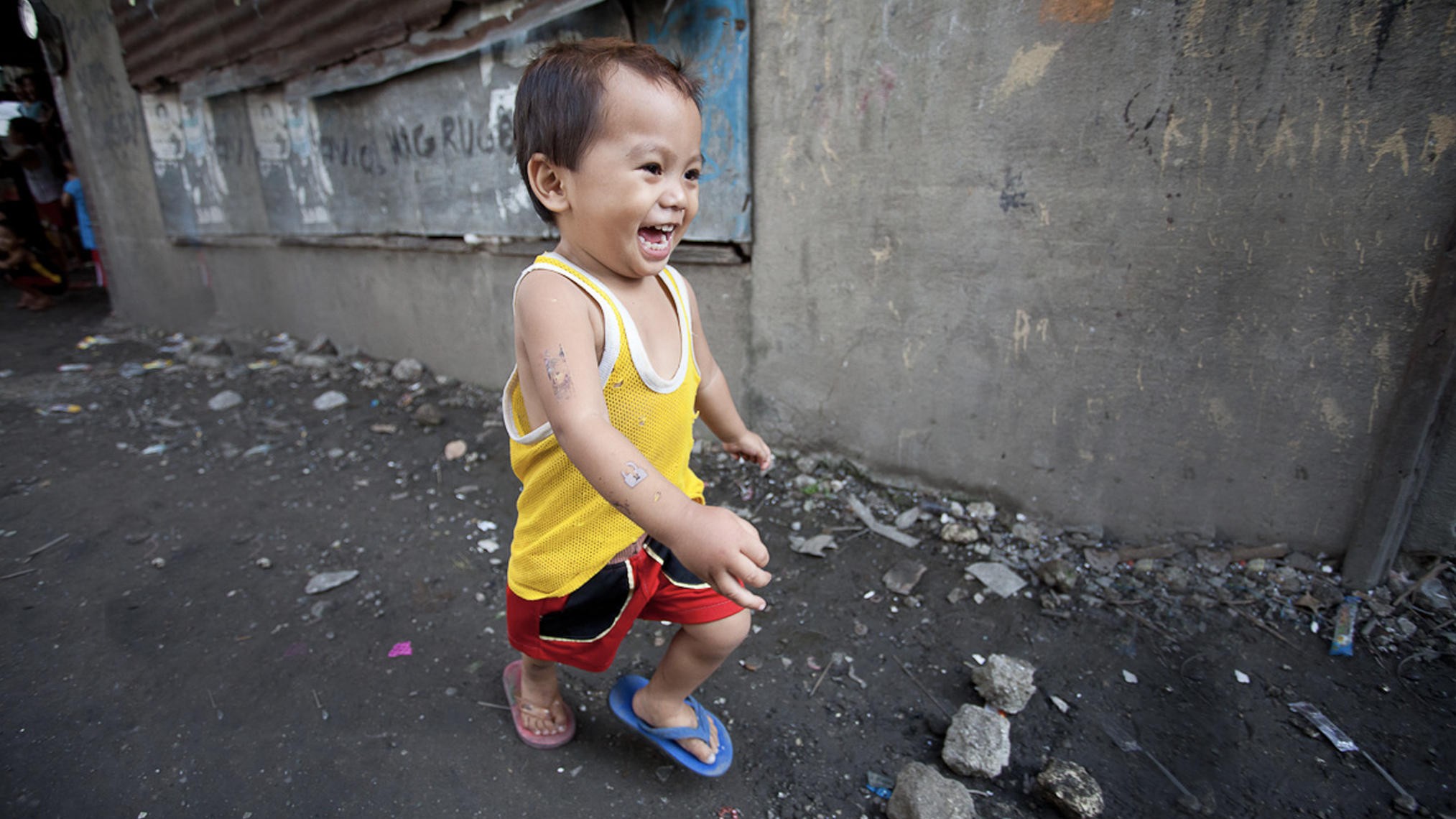
Audience: B2B (healthcare providers) and B2C (patients) audiences
Role: Senior graphic designer
Team: copywriter, email marketing analyst, product marketing manager, video production, render artist, web developer, print vendor, seismic lead
Tools: Adobe Photoshop, Adobe XD, Adobe Illustrator, Adobe WorkFront, Adobe Acrobat
Tactics: 80
Audience: B2B (healthcare providers) and B2C (patients) audiences
CASE STUDY: Dual Launch Campaign — AirFit N30i & AirFit P10
The Challenge
• Launch two products simultaneously without doubling production costs
• Execute 80+ assets across print, digital, and sales enablement under tight timelines
• Work within zero photoshoot budget, relying solely on existing product renders
• Maintain distinct positioning for each mask while avoiding brand fragmentation
• Ensure clinical accuracy and regulatory compliance across all materials
• Design for both B2B (healthcare providers) and B2C (patients) audiences
Additionally, the products occupied overlapping but nuanced use cases, creating a risk of confusion without a clear comparative framework.
My Creative Strategy: “Dueling Masks”
Rather than treating the products as separate launches, I identified an opportunity in their similarities and differences.
Both masks:
• Represented innovation in comfort and usability
• Targeted CPAP users seeking minimal, unobtrusive design
However, they differed in:
• Fit and frame structure
• Ideal sleep positions and patient preferences
• Usage scenarios and lifestyle alignment
This insight became the foundation for the “Dueling Masks” concept, positioning the products in a side-by-side visual and narrative system that:
• Clarified decision-making for clinicians and patients
• Highlighted product strengths without diminishing the other
• Created a cohesive campaign identity despite dual messaging
Print Design Leadership
Print was a critical channel for sales enablement and in-clinic education, requiring both visual impact and technical clarity.
I led the design and execution of:
• Product brochures and comparison guides
• Sales sheets and quick-reference tools
• Downloadable flyers and fact sheets
• Product guides for clinical and patient education
Key contributions included:
• Comparative layout system: Designed side-by-side frameworks that made differences instantly scannable while maintaining visual balance
• Information hierarchy: Structured content to support fast comprehension in clinical settings, prioritizing key differentiators and usage scenarios
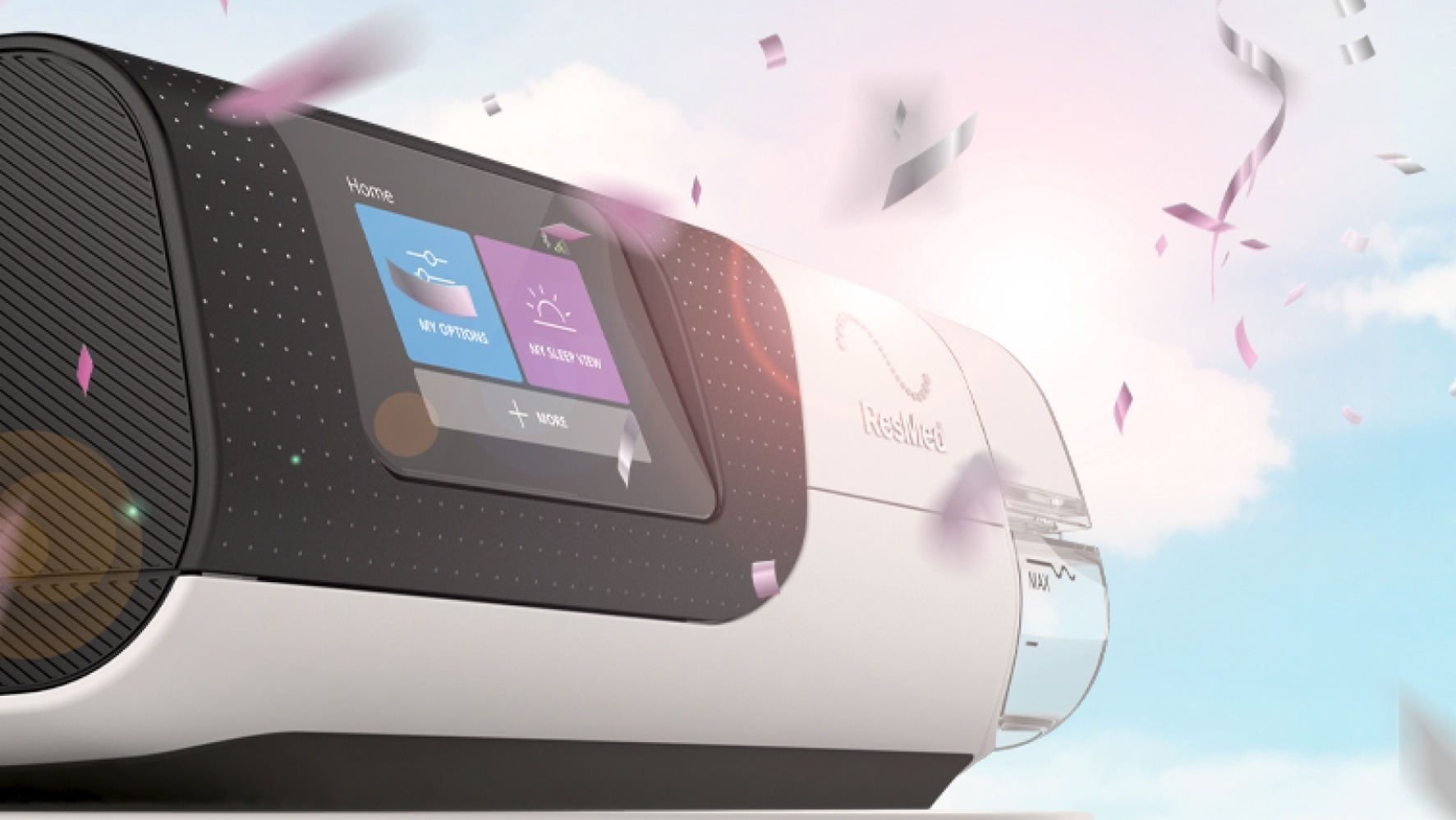
• Render-based art direction: Elevated existing product renders through lighting, cropping, and composition techniques to achieve a premium, cohesive look without photography
• Production efficiency: Built modular templates that reduced design redundancy and enabled rapid rollout of dozens of print assets
• Cross-functional alignment: Partnered with product, clinical, and regulatory teams to ensure all claims were accurate, compliant, and clearly communicated
The result was a print system that functioned as both a decision-making tool and a brand experience.
Visual System & Art Direction
Without the ability to produce custom photography, I developed a distinctive visual language using product renders as the hero element.
• Dynamic “duel” compositions to create energy and contrast
• Consistent lighting and color treatments to unify assets across channels
• Iconography and callouts to reinforce key features and benefits
• Motion storytelling: Concepted and produced a campaign video, art directing visuals, sourcing imagery, and selecting music to bring the “dueling” concept to life
This approach ensured the campaign felt intentional and elevated, rather than constrained by budget.
Rather than treating the products as separate launches, I identified an opportunity in their similarities and differences.
Both masks:
• Represented innovation in comfort and usability
• Targeted CPAP users seeking minimal, unobtrusive design
However, they differed in:
• Fit and frame structure
• Ideal sleep positions and patient preferences
• Usage scenarios and lifestyle alignment
This insight became the foundation for the “Dueling Masks” concept, positioning the products in a side-by-side visual and narrative system that:
• Clarified decision-making for clinicians and patients
• Highlighted product strengths without diminishing the other
• Created a cohesive campaign identity despite dual messaging
Print Design Leadership
Print was a critical channel for sales enablement and in-clinic education, requiring both visual impact and technical clarity.
I led the design and execution of:
• Product brochures and comparison guides
• Sales sheets and quick-reference tools
• Downloadable flyers and fact sheets
• Product guides for clinical and patient education
Key contributions included:
• Comparative layout system: Designed side-by-side frameworks that made differences instantly scannable while maintaining visual balance
• Information hierarchy: Structured content to support fast comprehension in clinical settings, prioritizing key differentiators and usage scenarios
• Render-based art direction: Elevated existing product renders through lighting, cropping, and composition techniques to achieve a premium, cohesive look without photography
• Production efficiency: Built modular templates that reduced design redundancy and enabled rapid rollout of dozens of print assets
• Cross-functional alignment: Partnered with product, clinical, and regulatory teams to ensure all claims were accurate, compliant, and clearly communicated
The result was a print system that functioned as both a decision-making tool and a brand experience.
Visual System & Art Direction
Without the ability to produce custom photography, I developed a distinctive visual language using product renders as the hero element.
• Dynamic “duel” compositions to create energy and contrast
• Consistent lighting and color treatments to unify assets across channels
• Iconography and callouts to reinforce key features and benefits
• Motion storytelling: Concepted and produced a campaign video, art directing visuals, sourcing imagery, and selecting music to bring the “dueling” concept to life
This approach ensured the campaign felt intentional and elevated, rather than constrained by budget.
Cross-Channel Execution
The campaign extended across a full ecosystem of touchpoints:
• Email campaigns for both B2B and B2C audiences
• Product landing pages and a centralized campaign hub
• Social media ads optimized for engagement and clarity
• Interactive and static sales tools
• Downloadable and print-ready collateral
To support scale and consistency:
• I created flexible templates and design guidelines
• Ensured alignment between print and digital experiences
• Collaborated closely with developers and marketers to maintain design integrity across platforms
Operational complexity and problem-solving
By implementing structured systems and clear creative rules, I was able to reduce friction and keep execution on track.
This project required balancing creative ambition with real-world constraints:
• Speed to market: Compressed timelines required parallel workflows across design, approvals, and production
• Asset scalability: Designing once and deploying across dozens of formats without compromising quality
• Stakeholder alignment: Navigating multiple product owners with differing priorities while maintaining a unified vision
• Localization readiness: Ensuring layouts could adapt to different languages and regional requirements
• Version control: Managing numerous iterations across 80+ deliverables
Impact
• Successfully launched two products simultaneously under a single, cohesive campaign
• Delivered 80+ assets on time despite budget and timeline constraints
• Improved product differentiation and clarity, supporting more informed decision-making
• Increased efficiency through templated design systems, reducing production time for future campaigns
• Elevated brand perception by transforming existing renders into a premium visual experience
Key Takeaway
This project demonstrates my ability to lead design at scale within complex, regulated environments, balancing creativity, clarity, and operational efficiency.
This project demonstrates my ability to lead design at scale within complex, regulated environments, balancing creativity, clarity, and operational efficiency.
By identifying strategic opportunities within constraints, in this case, leveraging product similarities and differences, I was able to transform a potential limitation into a defining creative concept that drove both cohesion and impact.