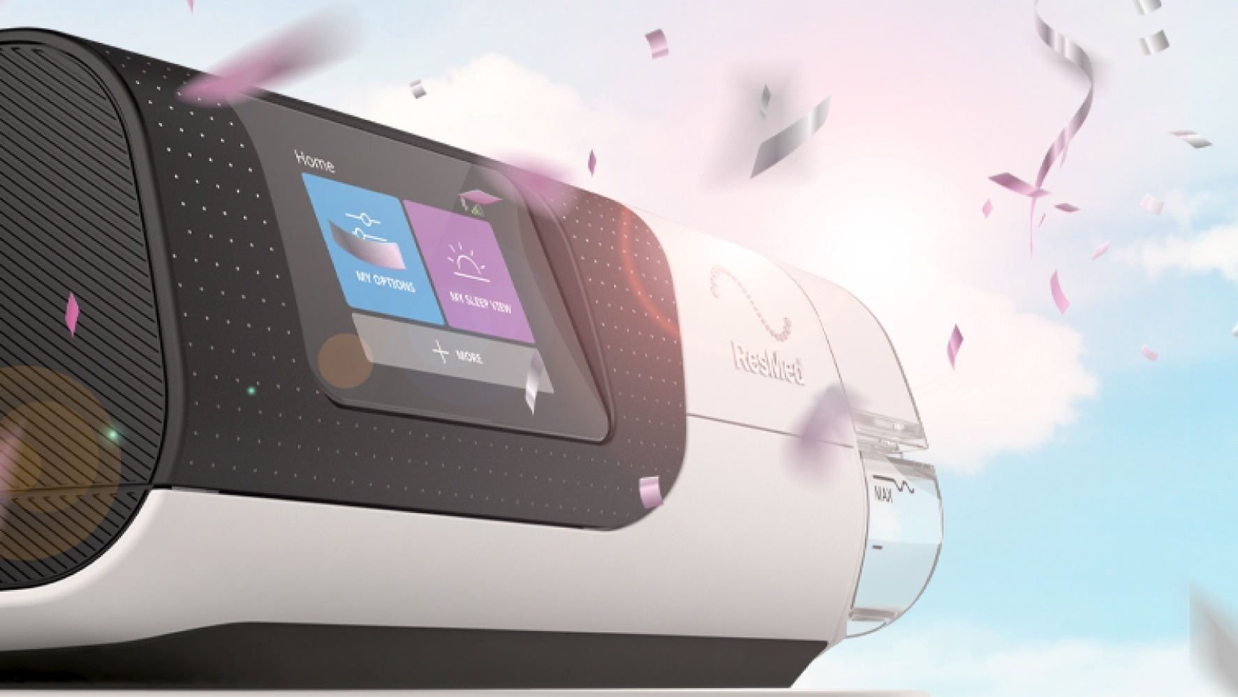
The AirCurve 11 bilevel device introduced a significantly improved patient experience through its streamlined form, intuitive touchscreen interface, and integrated cloud connectivity. The challenge was to reposition bilevel therapy, often perceived as complex and clinical, into a more accessible, patient-friendly solution without compromising scientific rigor.
I led the end-to-end creative direction for the global launch, building a design system that aligned product innovation with a refined, clinically credible brand expression.
>> Scroll to the end to view the full case study.
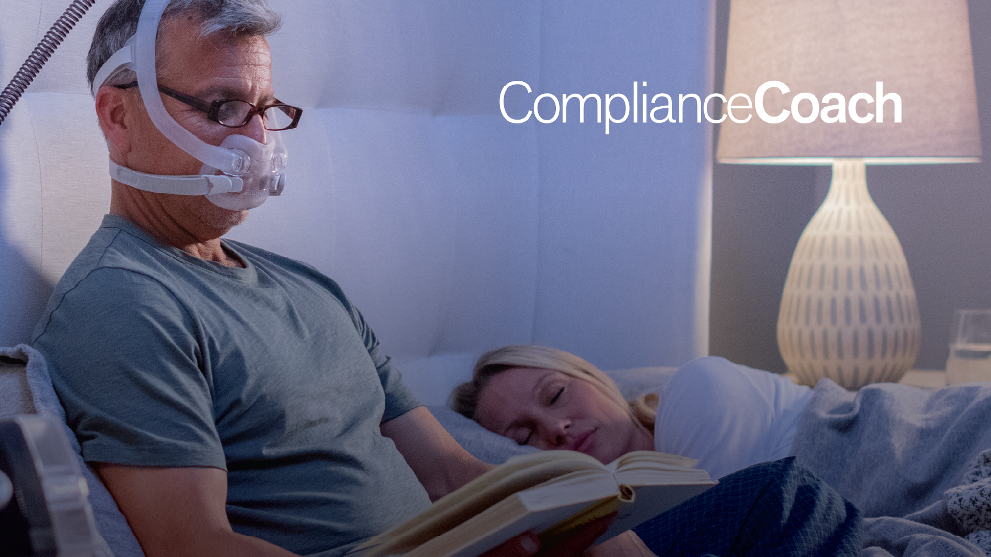
Launch Landing Page / Physician Audience
Launch Landing Page / Physician and HCP Audience
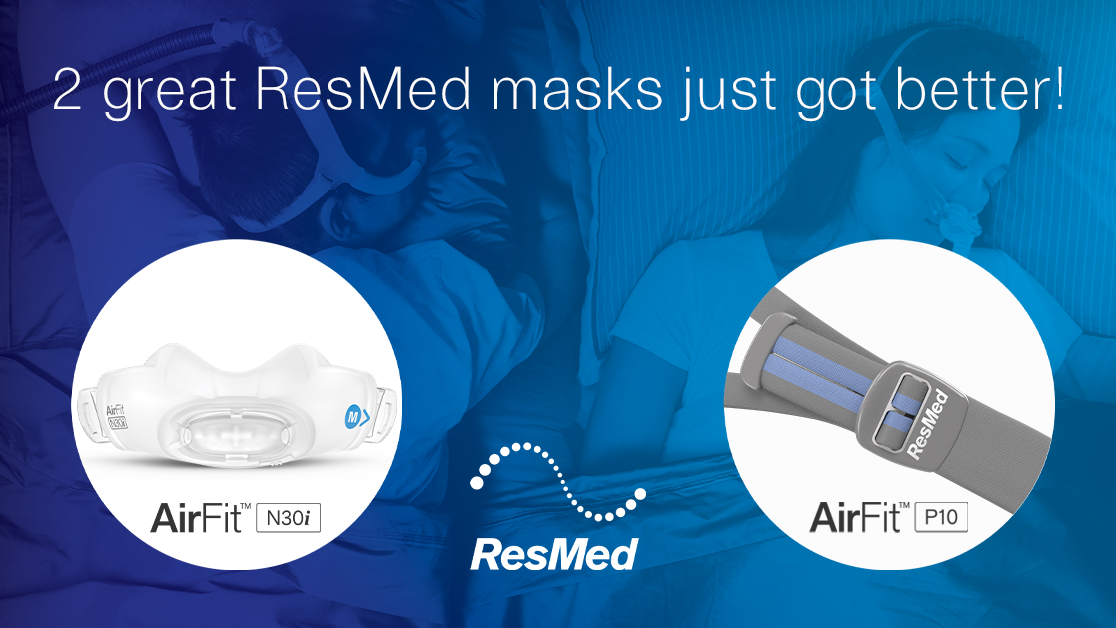
Packaging / Physician and HCP Audience
Print Brochure 8 page / Physician and HCP Audience
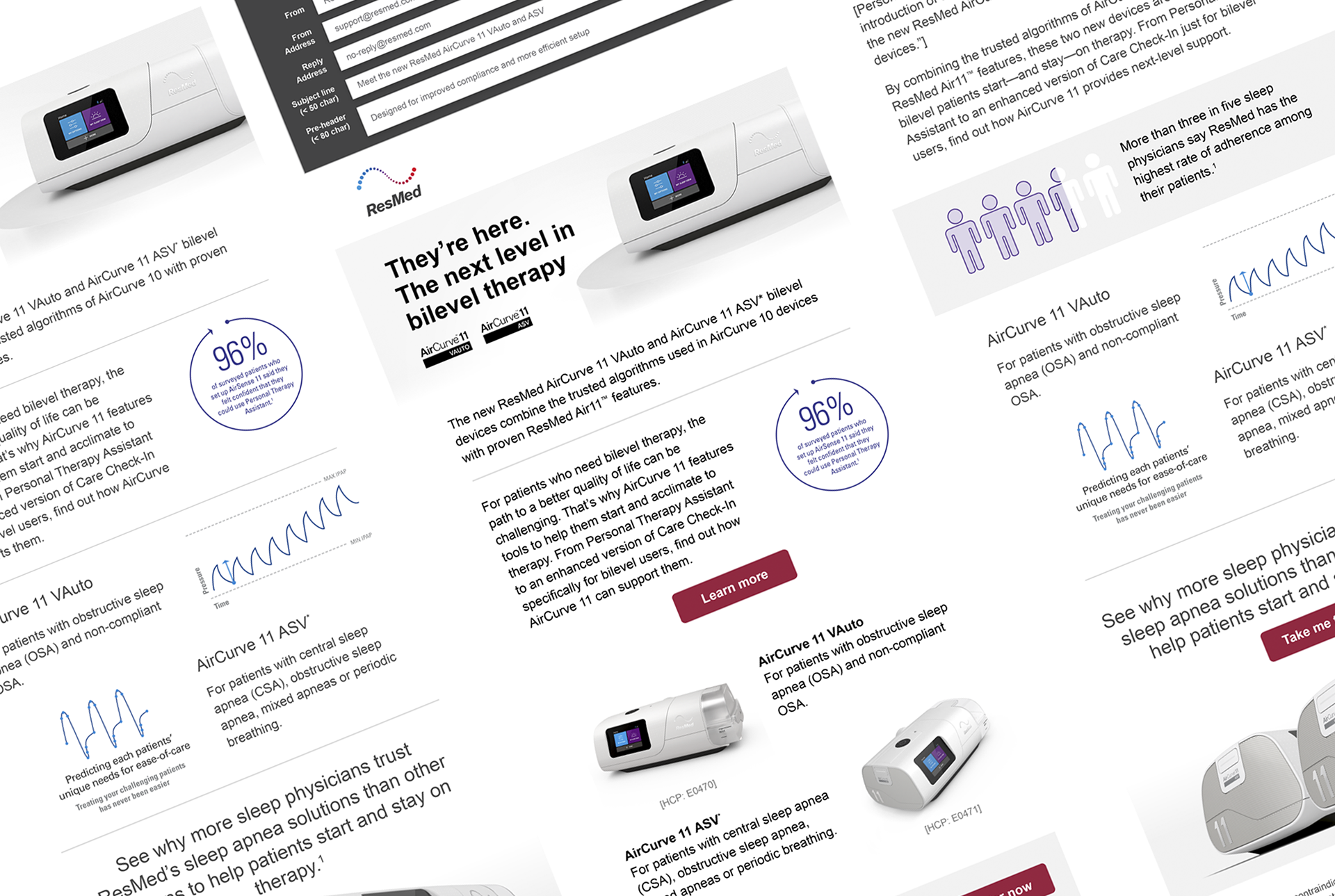
Emails / Physician and HCP Audience
CASE STUDY
Creative Strategy & Positioning
We intentionally departed from legacy bilevel campaigns, which leaned heavily on dense technical messaging and dated visual conventions. Through analysis of prior campaign performance, audience segmentation, and competitive audits, I established a bold headline framework designed to:
• Simplify complex therapy benefits into clear, digestible value propositions
• Emphasize patient comfort, usability, and lifestyle integration
• Support healthcare providers with concise, evidence-aligned messaging
This strategic foundation enabled consistency across all assets while allowing for regional nuance during localization.
Print Design Leadership
For print, the objective was to create materials that could command attention in clinical environments while maintaining the highest standards of medical accuracy.
I led the design and production of:
• Product brochures
• Sales sheets and quick-reference guides
• In-clinic posters
For print, the objective was to create materials that could command attention in clinical environments while maintaining the highest standards of medical accuracy.
I led the design and production of:
• Product brochures
• Sales sheets and quick-reference guides
• In-clinic posters
Key contributions included:
• Clinical-first design system: Developed a modular layout approach that balanced white space, typography hierarchy, and data visualization; ensuring rapid comprehension in time-constrained healthcare settings
• Information clarity: Translated complex therapy data into accessible infographics and iconography without diluting accuracy
• Material optimization: Partnered with production vendor to select finishes and substrates that elevated perceived quality while remaining cost-efficient at scale
• Regulatory alignment: Collaborated cross-functionally with clinical, regulatory, and legal teams to ensure all claims and visuals met compliance standards across global market
The result was a suite of print materials that felt both approachable and authoritative, supporting confident decision-making by clinicians.
Visual System & Art Direction
To unify the campaign, I developed a comprehensive visual language that extended across all channels:
• Custom iconography system to simplify key features and therapy benefits
• Art direction for photography, blending clinical realism with lifestyle-driven patient moments
• Refined color and typography system that reinforced clarity, hierarchy, and brand differentiation
This system created a recognizable and scalable identity that could flex across formats without losing integrity.
Digital Integration & Cross-Channel Execution
While print was a critical pillar, the campaign was designed as a fully integrated ecosystem.
I translated creative concepts into wireframes and high-fidelity designs using Adobe XD, supporting:
• Responsive product landing page
• An email marketing campaign
• Interactive sales tools (Seismic, Salesforce)
To ensure seamless execution:
• I built flexible templates and component libraries for global teams
• Maintained consistency between print and digital experiences, reinforcing brand cohesion
Global Rollout & Localization
Following final approvals, including translation and medical/legal and regulatory review, the campaign was deployed across:
• Europe
• Canada
• Australia
I established guidelines that enabled regional teams to localize content efficiently while preserving the integrity of the core design system, ensuring both global consistency and local relevance.
Impact
• Elevated perception of bilevel therapy through a more modern, patient-centric visual approach
• Improved usability of print materials in clinical settings through clearer hierarchy and simplified messaging
• Enabled scalable global rollout with reduced design redundancy through templated systems
• Strengthened alignment between marketing, clinical, and sales teams through cohesive cross-channel design